How I streamlined design QA by developing a process for designers and developers.
Designing smooth, transparent, and collaborative processes.

Quick facts
Strategy
Process
Cross-functional collaboration
Quality assurance
Communication
Efficiency
Product design
UI
Designing smooth, transparent, and collaborative processes.
2 min
Tools I'm in-n-out of
🔙 Background
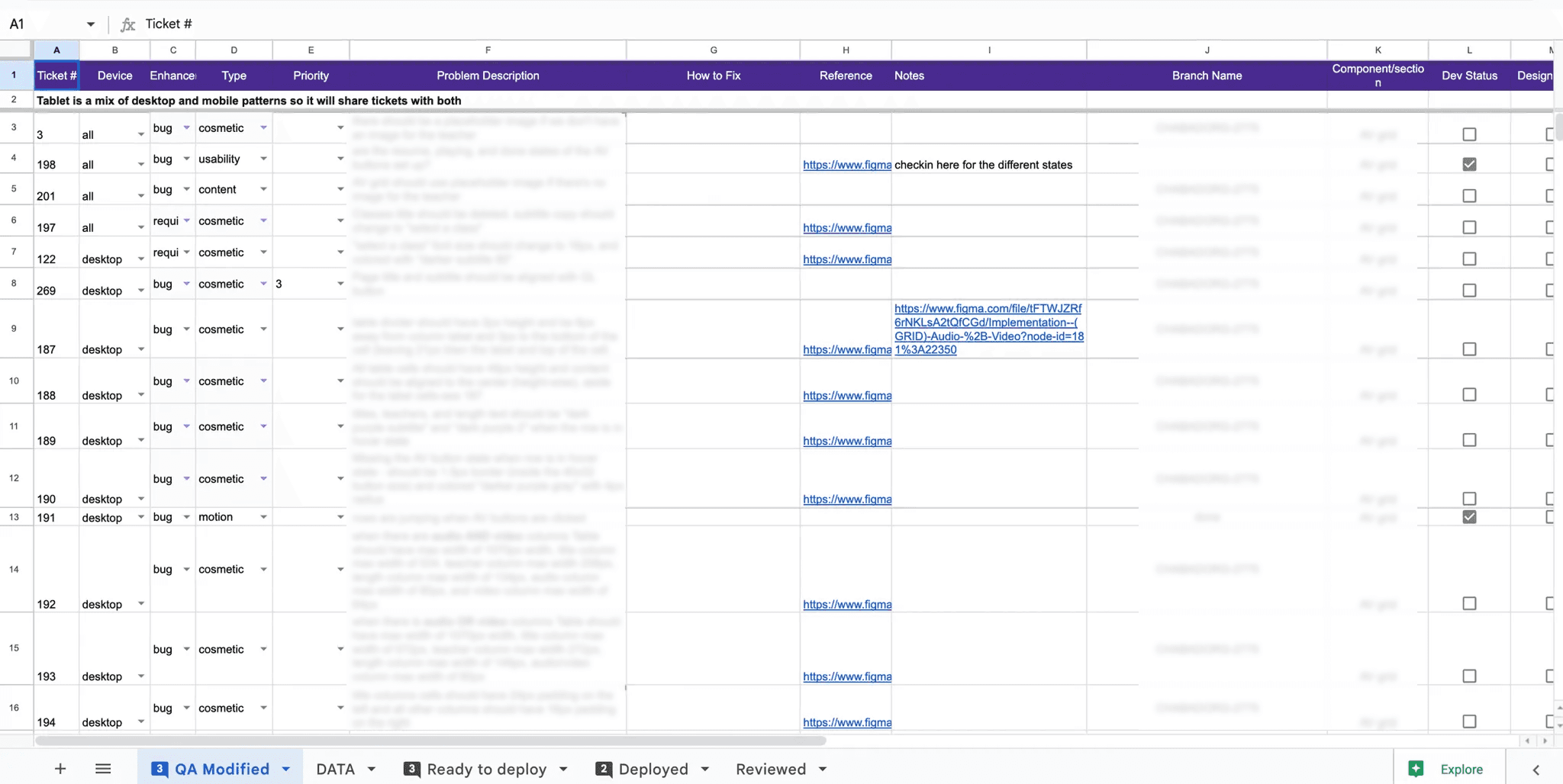
Engineers were building designs created by an in-house product team. The developed product was quite different from the original spec and needed to go through numerous rounds of QA. The process was becoming cumbersome and challenging to track, update, and evolve in individual spreadsheets as well as the growing number of spreadsheets.
✅ Goal
💪 Challenge
How could this tedious process be simplified and easy to complete so teammates can focus on doing the task at hand instead of figuring out how to document it and communicate their findings?
👩💻 My role
🤝 Worked with
Dev team lead, project manager, devs, and product designers.
⚠️ Note
If you're a Notion fan, like I am, you're aware that there have been incredibly useful feature releases that could be incorporated in future iterations to create an even smoother and seamless process.
📸 Snapshot
Before - tedious without tracking support.

Google sheets QA
After - clean and focused

Notion QA database
🎉 Making it real
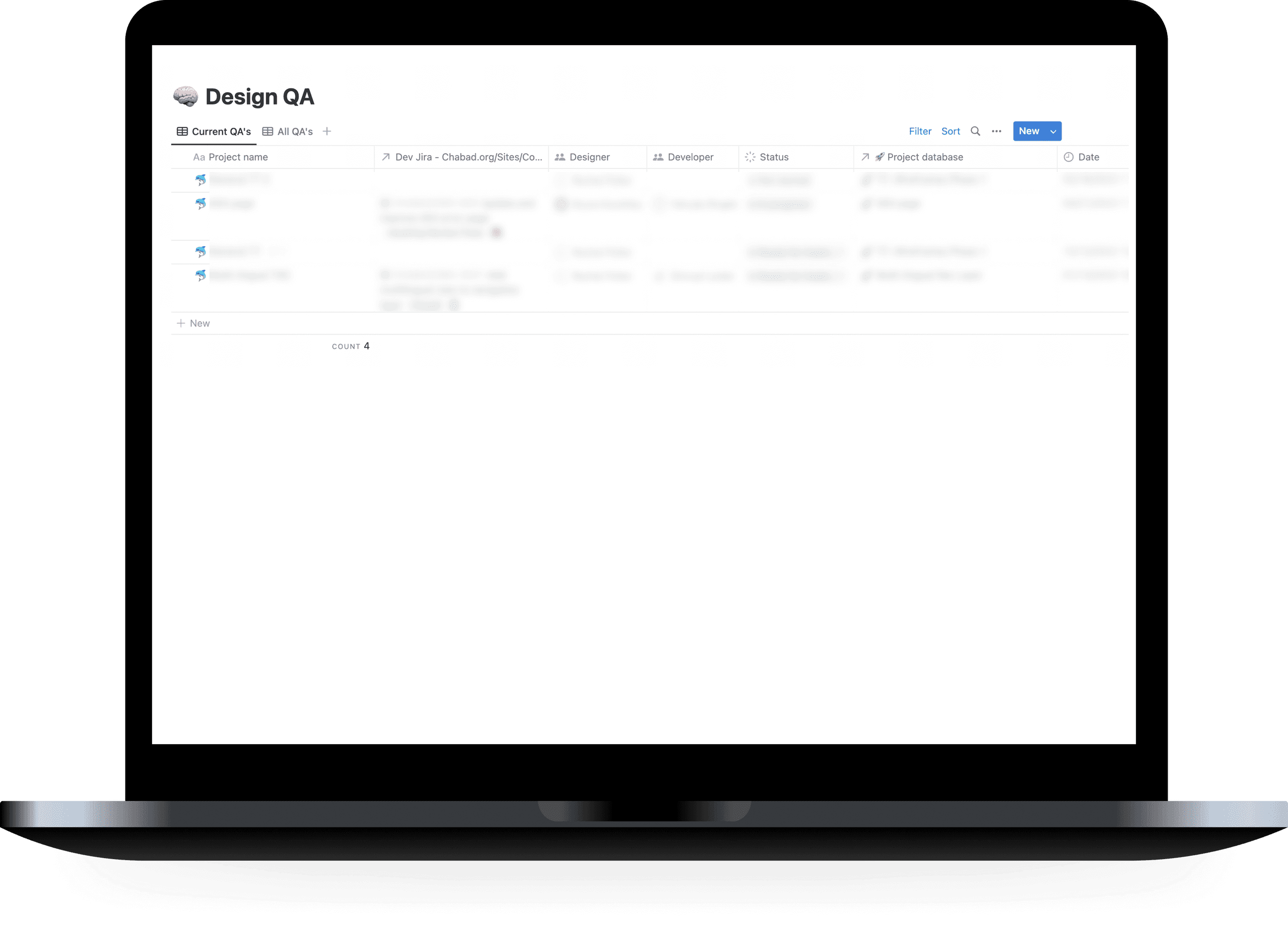
QA home base
I started with a central Design QA database to act as the home base for all QA’s. The database was customized with multilayered templates.
As the number of QA’s done or in progress grew, I added a default view to only show current QA’s to reduce the cognitive load when looking for or creating QA pages.

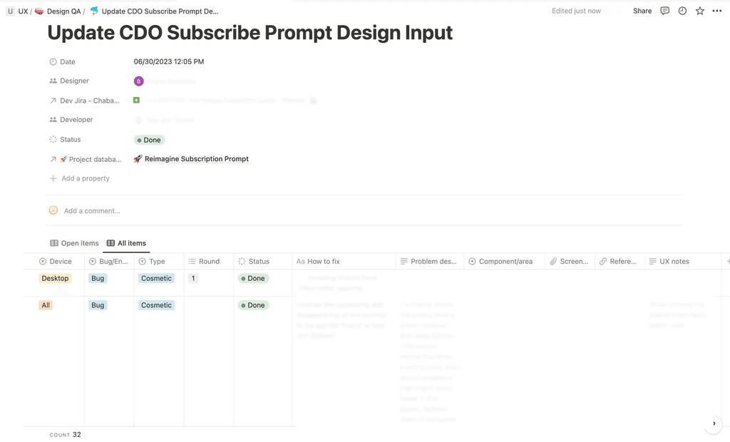
Main QA page
Template beauty
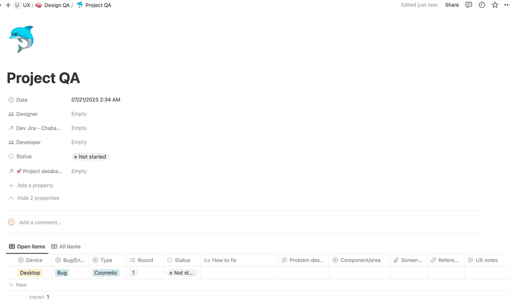
I created a QA template which creates a page in the main QA database for that particular project. That page includes:
A database with all of the necessary columns to conduct the QA. These columns were created to guide QA conductors on what information would be helpful and provide a quick and accessible view of the main datapoints.
Useful datapoints
Pre-filled selections for commonly used options or the option that’s usually started with, such as, device, item type (bug, enhancement etc), category (cosmetic, content, motion ect), and round.
Default view for open items and second view for completed ones.

Inside of a QA page with individual QA database columns created and default options selected.
📕 Reflections + impact
🔬 What I learned
I’ve learned that some things that felt obvious or simple to me weren’t that way to others and to hear teammates frustrations as points to be curious about and look at how the process can be designed to ease those pain points.
🪜Next steps
As product designers and developers use this process, I'll look out for frustrations to continue iterating and improving the experience for all team members.
Have questions? Want to work together?
Or find me on LinkedIn + rochelpolter@gmail.com.


